Temple Israel
How one of the country’s oldest synagogues embraced tradition in a fresh way.
previous logo
The Situation
Founded in Memphis in 1854, Temple Israel is one of the oldest and largest synagogues in the United States. Like so many institutions, they needed their brand communications to look more consistent - they just weren’t sure how to do that.

The Goal
Engaged by Temple Israel to develop a consistent formatting system, Tactical Magic discovered an opportunity to also reinterpret the congregation’s “burning bush” logo.

The Solution
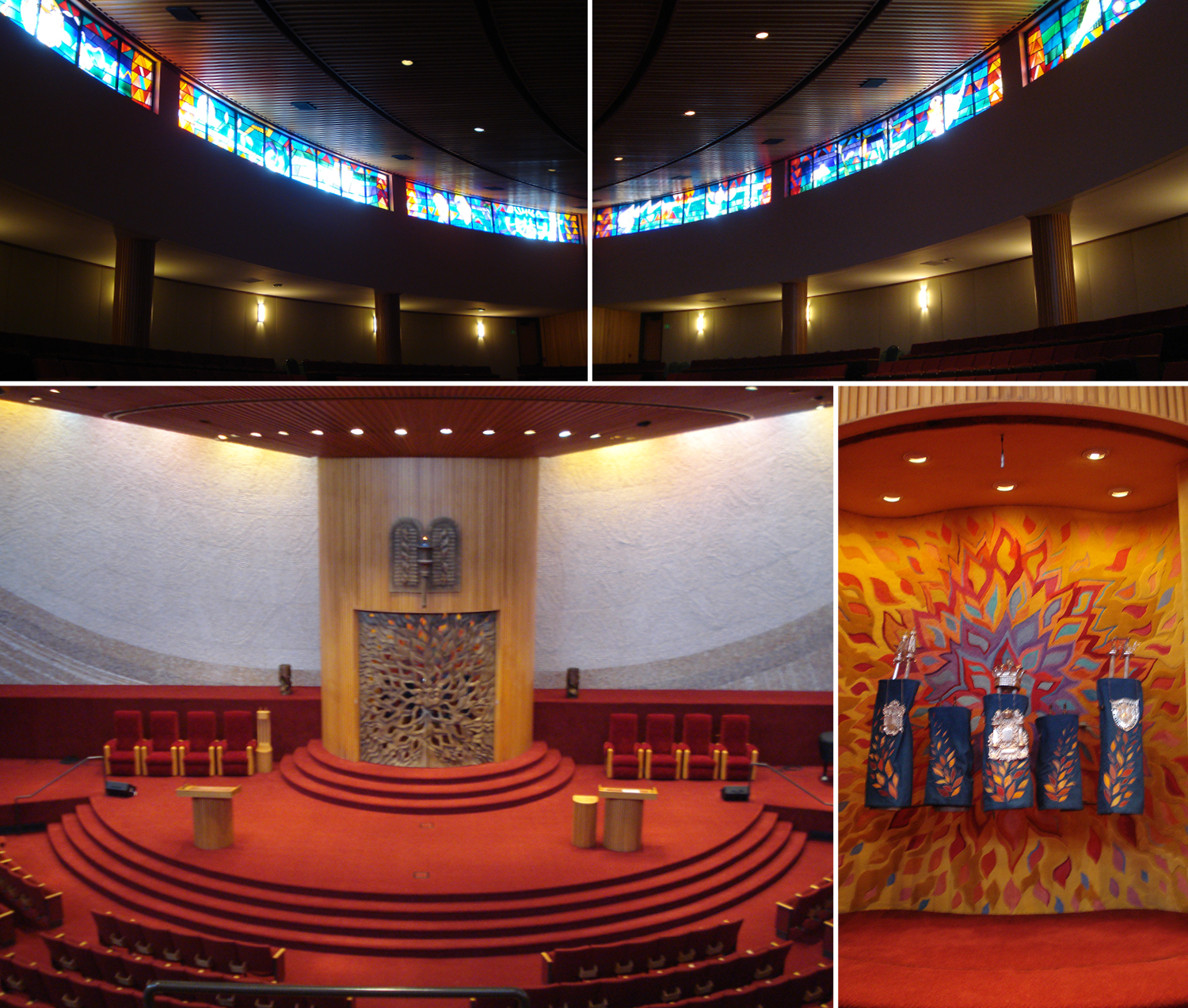
Rabbi Micah Greenstein elaborates on the symbolism of the new logo, “Frankly, I was amazed at the depth of thought behind this seemingly simple image for Temple. It was brilliant of Trace to take the previous Temple logo and re-shape it into four Hebrew letter shins. He captured the shin on the ark of our sanctuary, the same shin that appears on the doorposts of our homes, and the name for God Almighty (Shaddai), which begins with the letter shin in the Torah. He went even deeper by making it four shins, representing the four matriarchs of the Jewish people. The twelve flames represent the twelve tribes of Israel, especially fitting for a historic congregation like ours. I was taken aback by something so simple, beautiful, and profound as four shins igniting the eternal light of our faith.”
The Outcome
The new symbol was also incorporated in complementary identity treatments for the Barbara K. Lipman Early Learning Center, the Wendy and Avron Fogelman Religious School, and the Temple Israel Museum. The updated identity system is the cornerstone of a larger effort to provide staff and lay leaders with consistent tools for electronic and print communications.

“We now have a consistent image to project in all our printed materials. Beyond the efficiency and economy of scale Temple will reap in the long run, we may very well have the most meaningful and exquisite synagogue image to project not only to the Jewish community but to the entire community of faith.”
- Micah Greenstein, Rabbi, Temple Israel